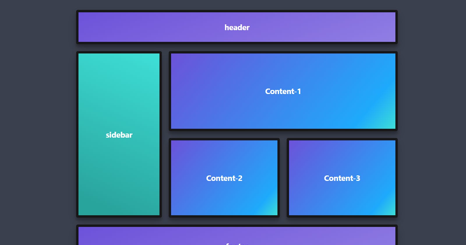
CSS Grid is a layout system for the web, allowing developers to create complex, responsive designs using rows and columns
Grid is used to make complex web design layouts more easily.
First things first, we have to make a div and give it a class of container or anything you want.
<div class="container">
  <div>one</div>
  <div>two</div>
</div>
- After creating our div, let's go to our CSS and start applying grid on it. we assign our container a display property of grid.
.container{
display: grid;
}
- Now, After assigning display: grid; nothing happens, because we didn't set the width of the container, so for that, there is a different property in Grid to set the width which is "grid-template-columns".
.container{
display: grid;
grid-template-columns: 50% 50%;
}
- So, this gives us Two Columns of each having 50% width.
NOTE: There is a Short-hand property to write grid-template-columns,
.container{
display: grid;
grid-template-columns: repeat(2, 50%);
}
The "repeat()" property works same as the above values which is 50% & 50%, but, here instead of writing 50% twice, we set it to repeat() then "2" which means to create "2" columns & then "50%" which means to set a width of 50%.
KEY-POINT:- Instead of using % or pixels, we use fr(fraction) in grid-template-columns value. for ex. 1fr, 2fr, 1/2fr ......etc.
.container{
display: grid;
grid-template-columns: repeat(2, 1fr);
}
"fr" works very well and it's very important to add for responsiveness of the website.
- Now, if we want spaces b/w our grids, then the property for that in Grid is "gap or grid-gap or row-gap/column-gap".
.container{
display: grid;
grid-template-columns: repeat(2, 1fr);
grid-gap: 10px
}
This grid-gap property gives us a space of 10px around our rows and columns.
If you want to add a gap in b/w rows or columns, you can use a property of row-gap or column-gap.
.container{
display: grid;
grid-template-columns: repeat(2, 1fr);
row-gap: 10px;
}

or or or

.container{
display: grid;
grid-template-columns: repeat(2, 1fr);
column-gap: 10px;
}
- Now, in order to add some height to our container, we use a property in grid called "grid-template-rows".
.container{
display: grid;
grid-template-columns: repeat(2, 1fr);
grid-gap: 10px;
grid-template-rows: 200px;
}
- But there's a catch in "grid-template-rows", Now from the above given example, you might think that what if our content is more than 200px and then our content starts overflowing and it doesn't look good on layouts, So what might be the solution here. You must be thinking, oh, I wish there would be a property that adjusts itself according to the content...... and guess what, there is a property for this called "grid-auto-rows".
 .container{
display: grid;
grid-template-columns: repeat(2, 1fr);
grid-gap: 10px;
grid-auto-rows: minmax(200px, auto);
}
Now, in the "grid-auto-rows" property you write minmax(), and in between parenthesis, you add two values. In the above examples, we add "200px" as a minimum value and "auto" as a maximum value.
Now if our content is less than 200px or exactly 200px there won't be any issue and it gets fit in easily, but if our content is more than 200px, let's say 300px, then our auto property works and our rows will adjust according to the content size and fit in easily without overflowing.
